Ammonite
Kamiyaa Technology: June 2023 - Aug 2023
My role
UX/UI Designer - Design System, Web Design, MVP Design, UX/UI Design, User Flow, Design Iteration, Wireframes.
Tools
Figma
Timeline & Stutus
3 months, Hand-off Successful
Overview
Ammonite is a direct alternative web application to Fandom that places an emphasis on community collaboration through open source knowledge contributions for others who shares a common interest.
Team
Jeff Z (Kamiyaa Technology): Product Owner/Developer
Highlights
Web platform that focuses on intuitive knowledge contribution.
Impact
Some impacts that this design made.
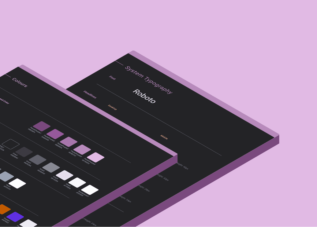
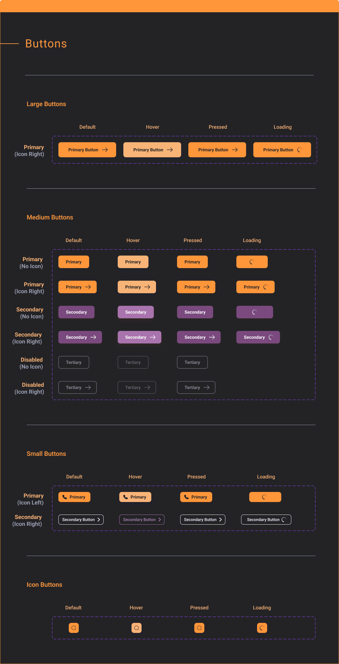
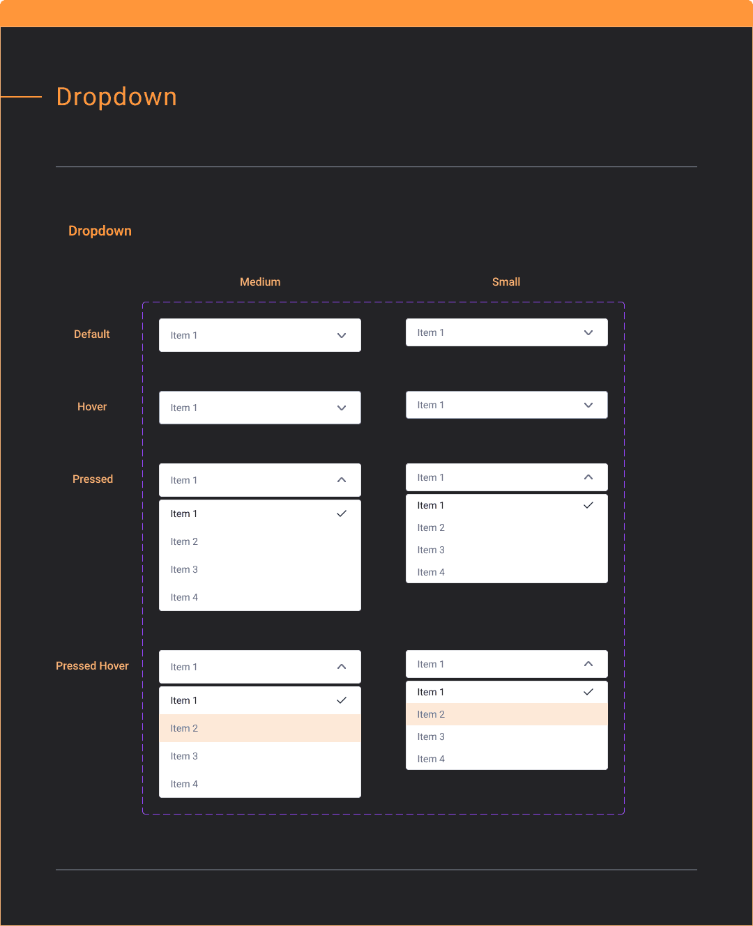
Clarified essential features and crafted MVP with scalable design system. This allowed the client to save 40% of foreseeable fallacy cost when scaling up the platform.
Process
How I worked on scalable web application design.
Kick-off
I worked with the product owner to clarify product need:
Identify features and Product Requirement Document (PRD)
Scalable Information Architecture (IA)
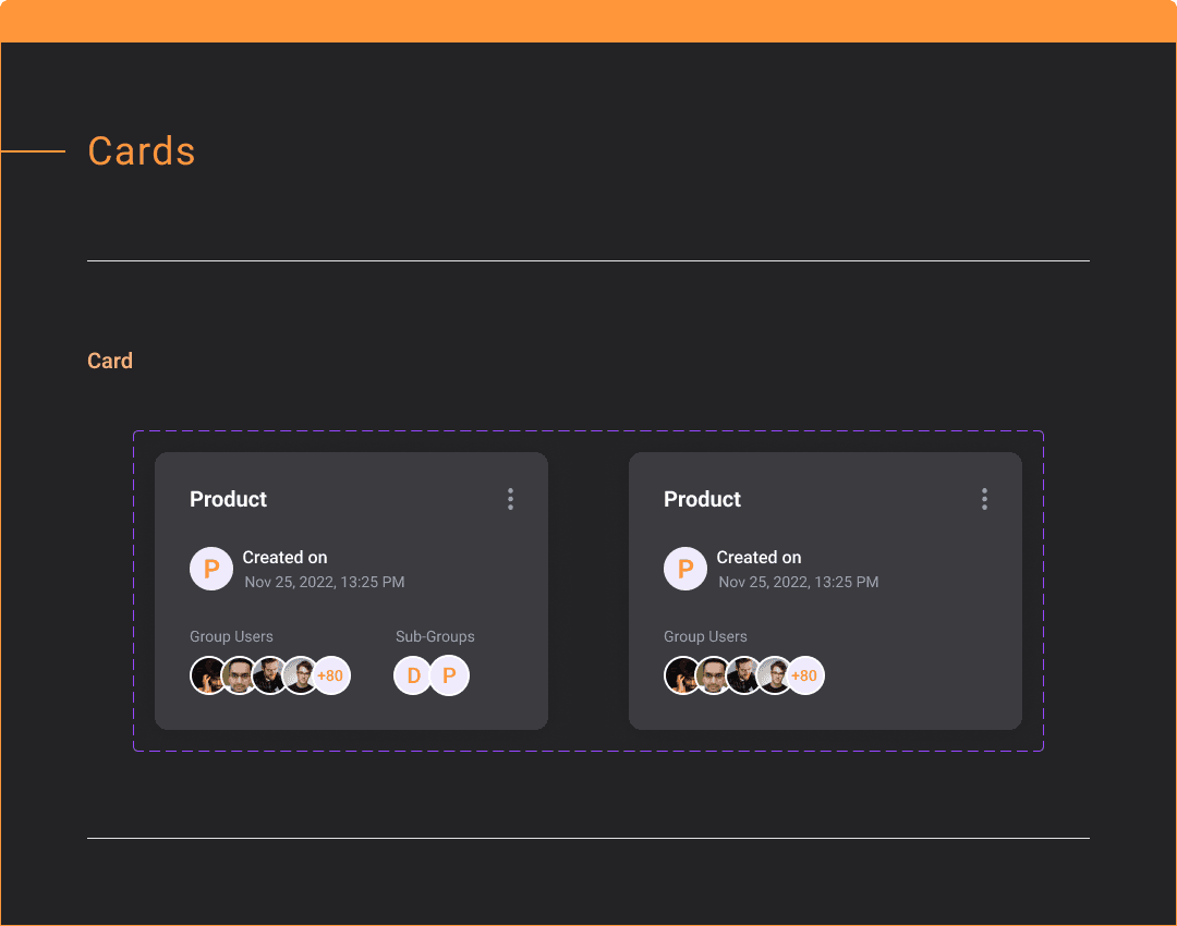
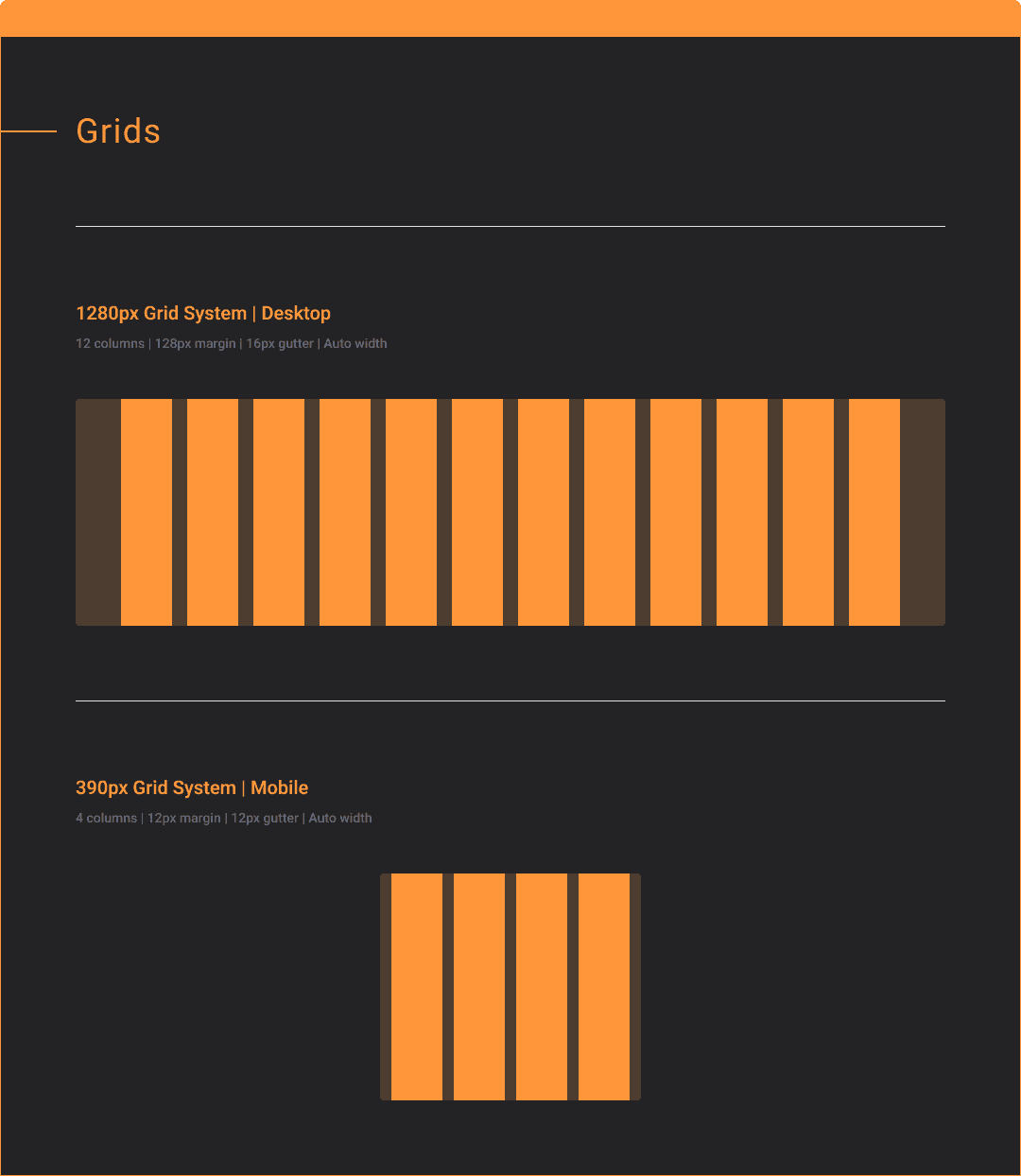
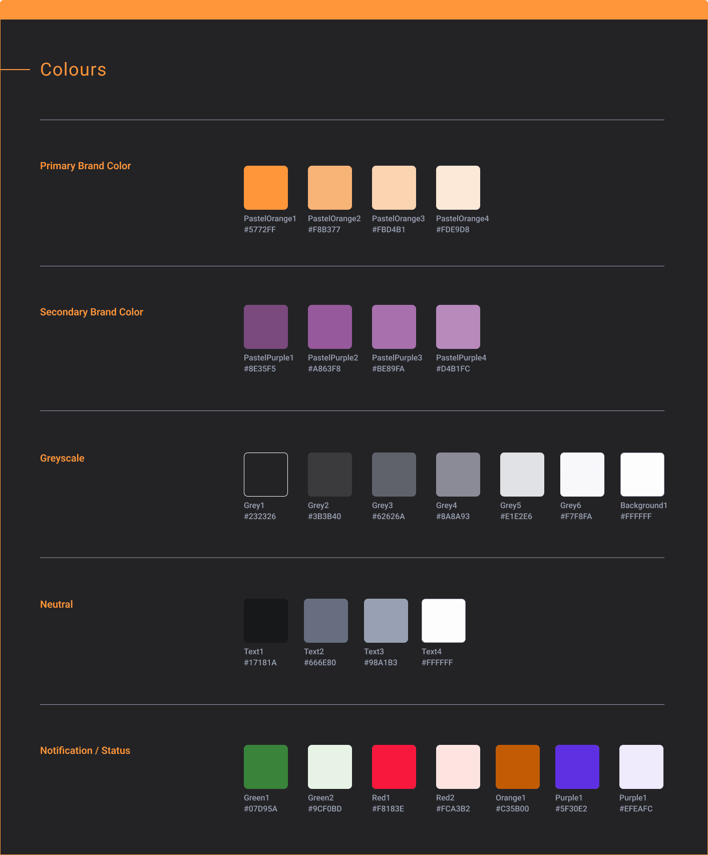
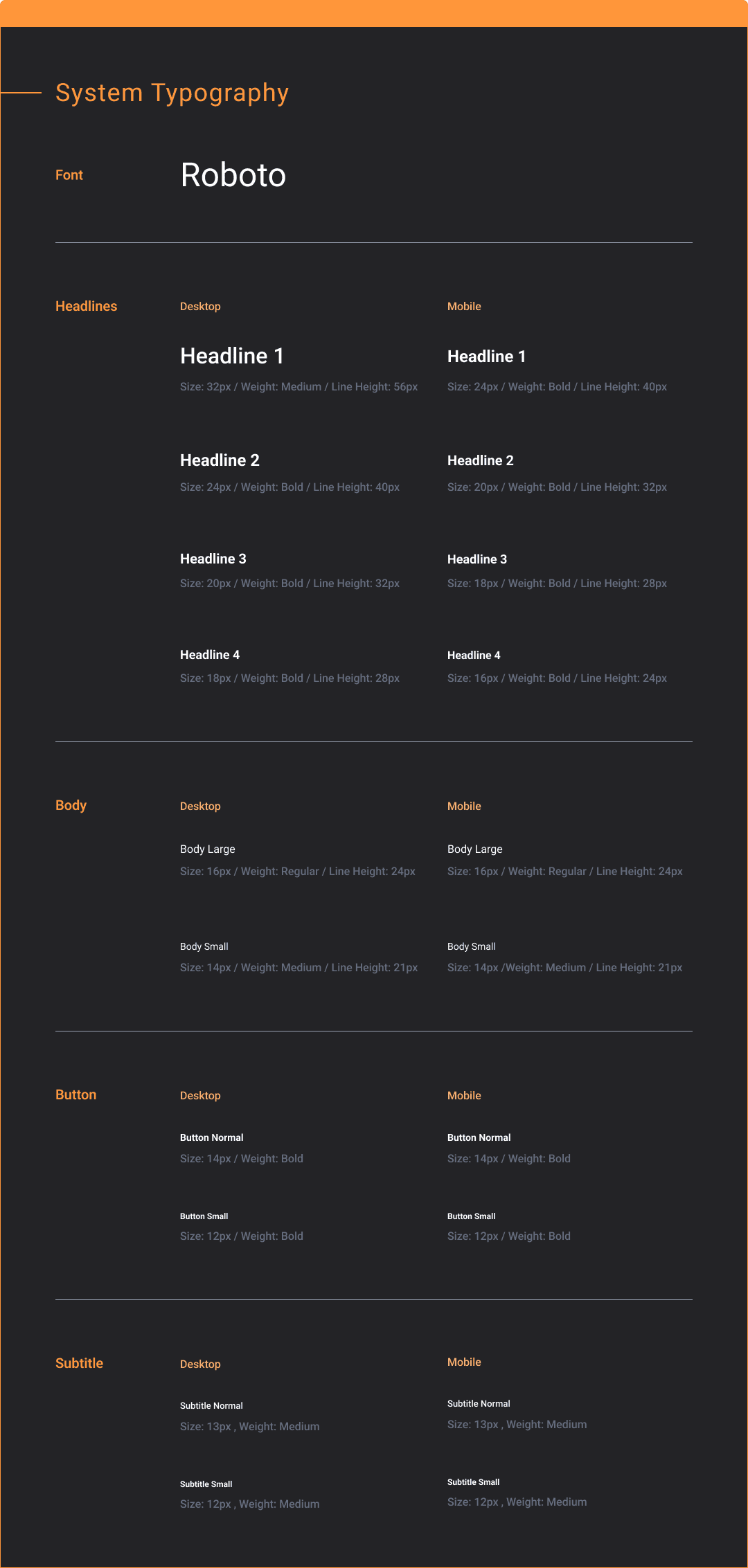
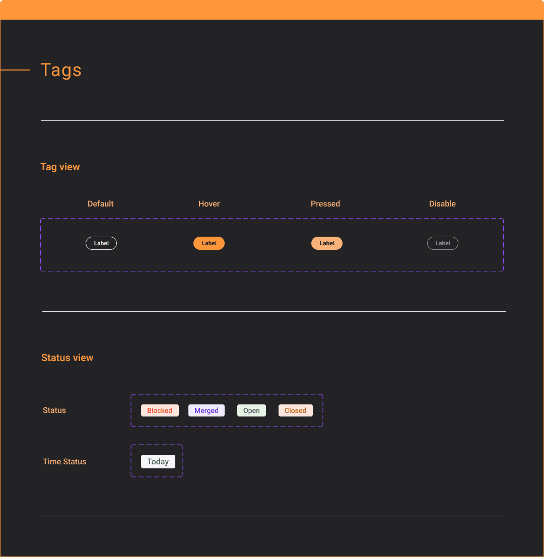
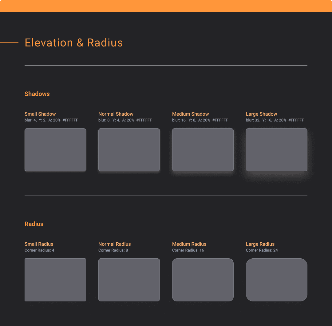
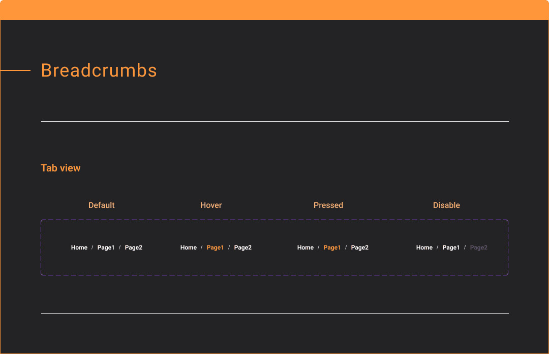
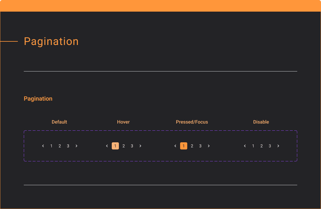
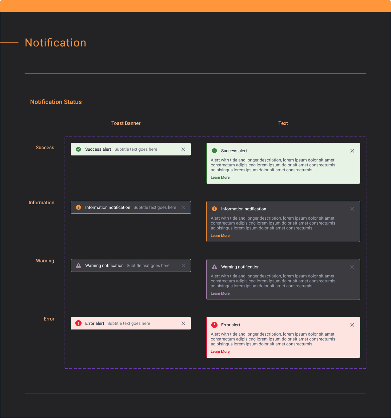
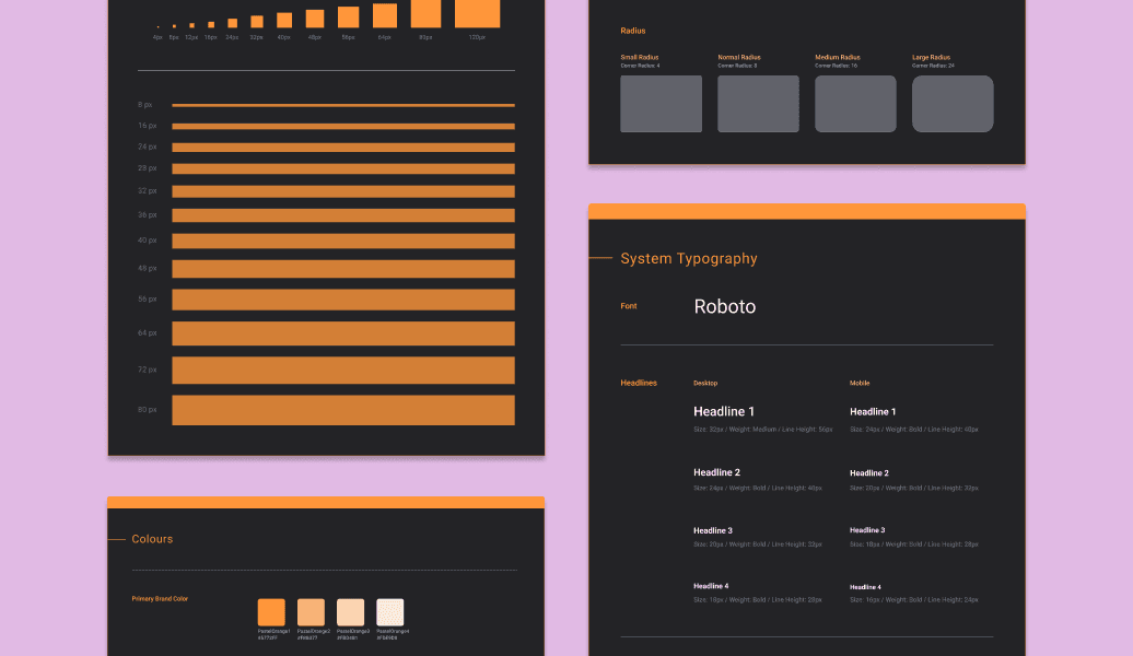
Scalable design system
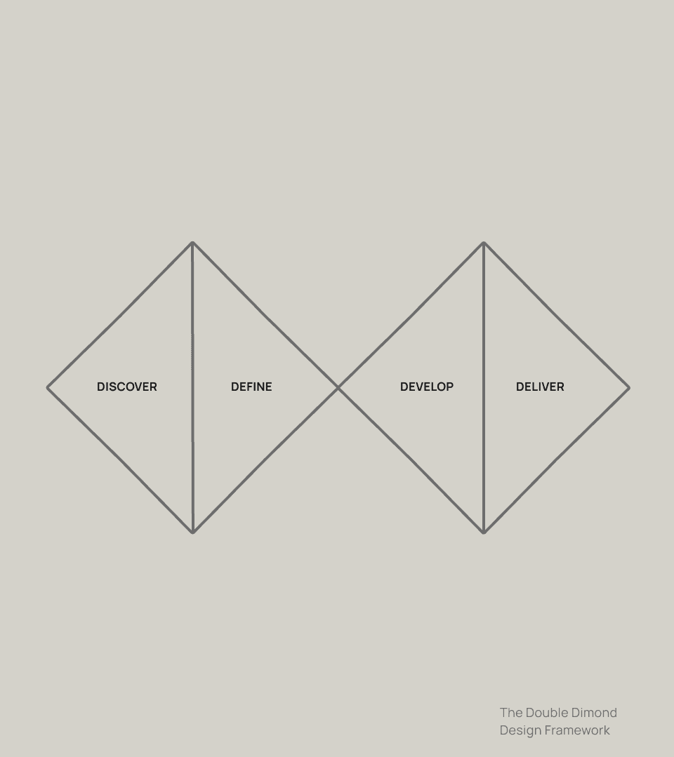
Double Diamond Framework
I decided to use double diamond framework because it allows for exploration and narrowing the scope for refinement while approaching numerous problems.
discover - Moodboarding & PRD
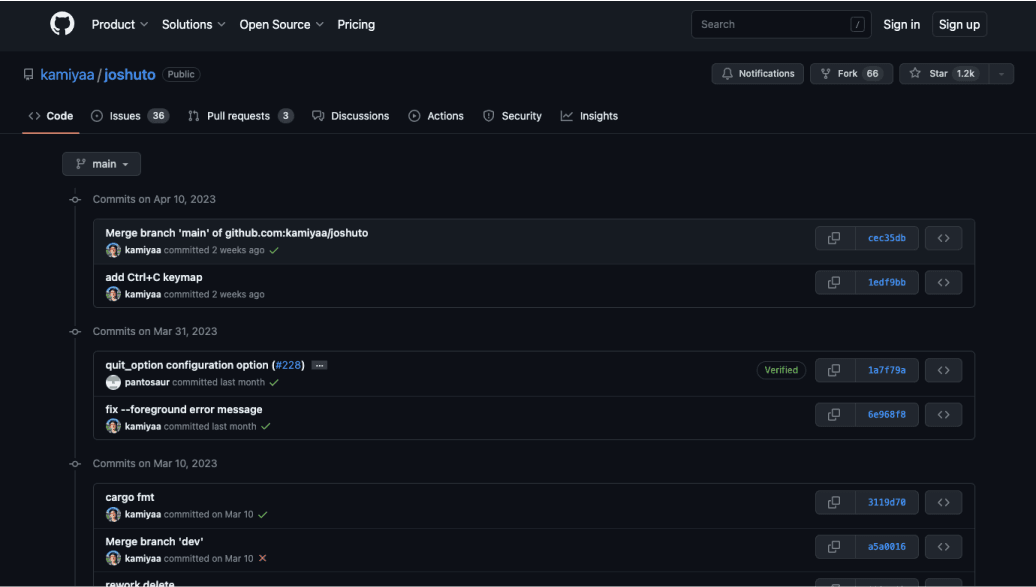
Product owner wanted the platform take inspiration from Github while being a direct competitor/alternative to Fandom. I took a look at both platform to understand potential user misalignment and ways to design Ammonite. Here are insights I've discovered:
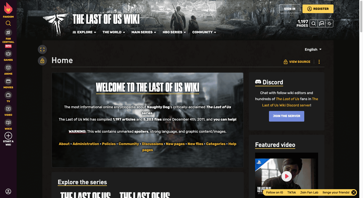
Current Fandom have confusing grouping with a lack of community inclusion.
Github have many unfamiliar UX writing such as "fork" and "pull requests."
UX/UI Inspiration Organization
Learned vs Intuition?
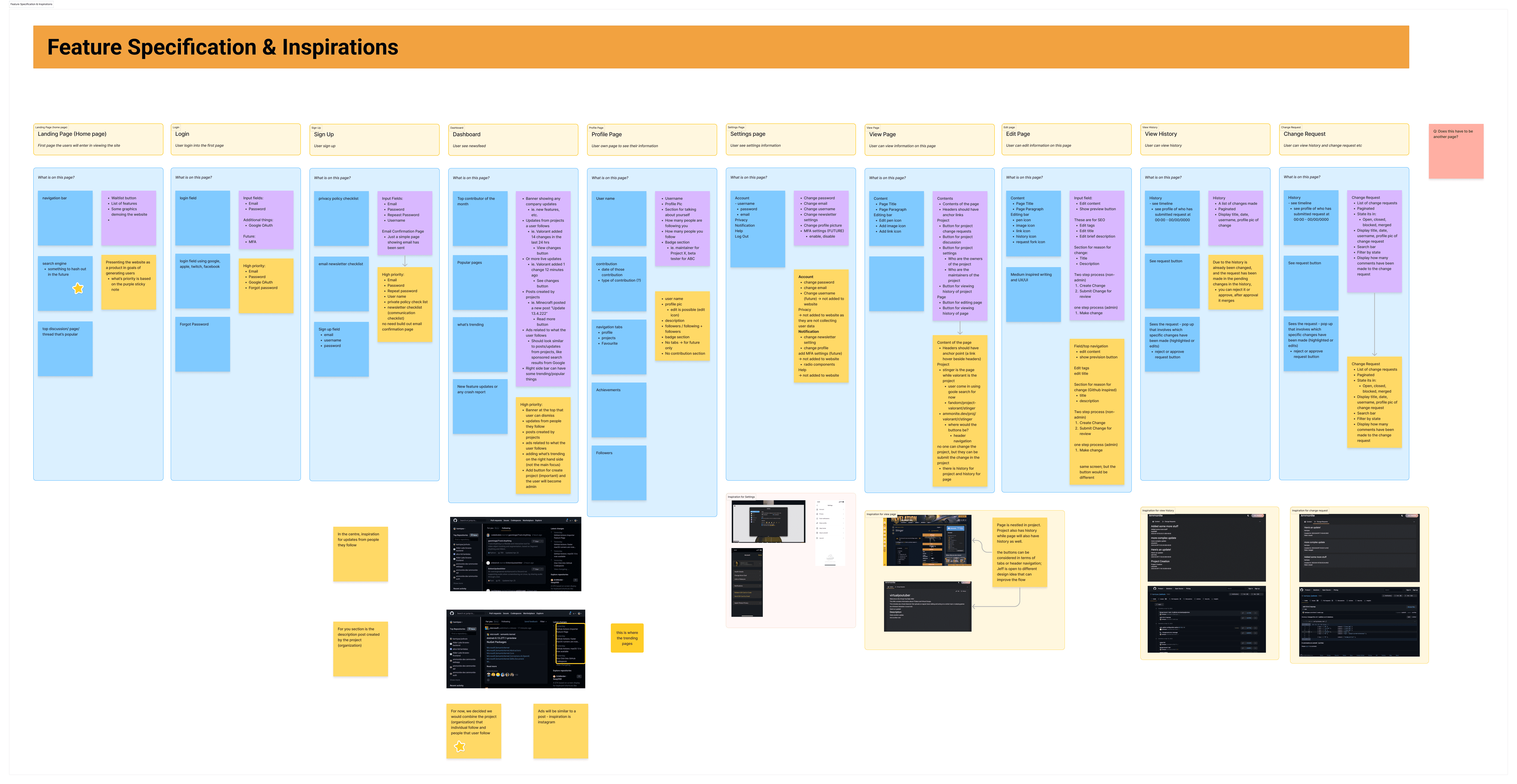
After cross-analyzing product features from Github and Fandom, I led a workshop to establish key features for individual screens. Some essential features introduced were learned behaviour and were not intuitive.
Specifically, I considered the function of admin approving "pushed" edits by another user as a learned behaviour.
Feature Specification & Inspirations
Design challenge
How can I design a inclusive platform that's simple and intuitive for general audience?
Proposed Design Strategy
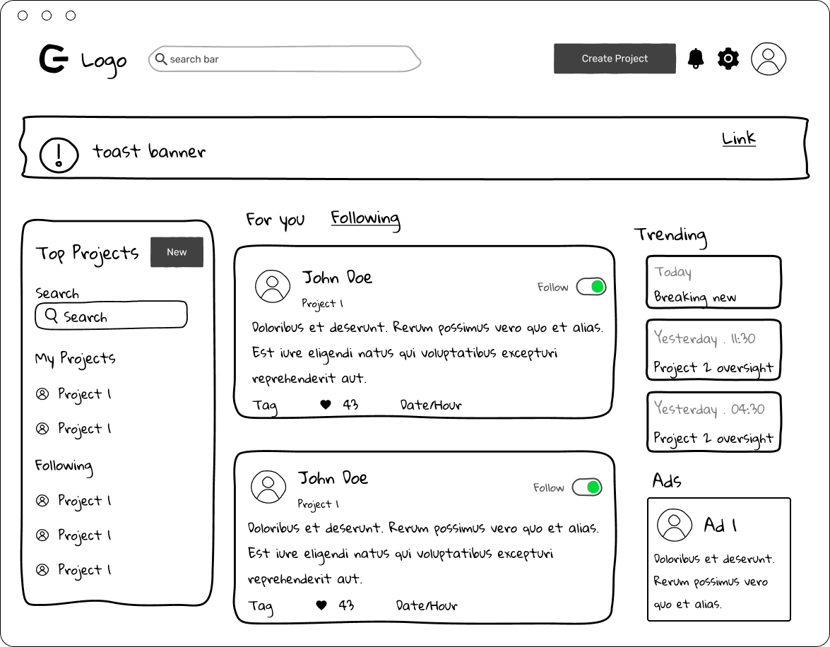
I decided to prioritize the newsfeed as a main ways for users to feel a sense of community and simplify UX writing to be more relatable, using language often used for Google document collaboration or Medium article writing.
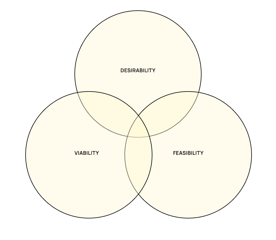
Desirability: it makes sense for end user to receive community updates and for admin to maintain the growing fandom with bigger flexibility and transparency.
Feasibility: it's technically possible to introduce news feed, live editing and also version history in foreseeable future.
Viability: it's likely that users will like to follow a specific group for meet up events such as anime or comic-con.
Define- IA & User Problems
I established IA with better categorization system for easier identification via grouping.
IA
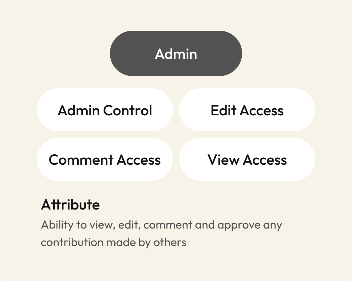
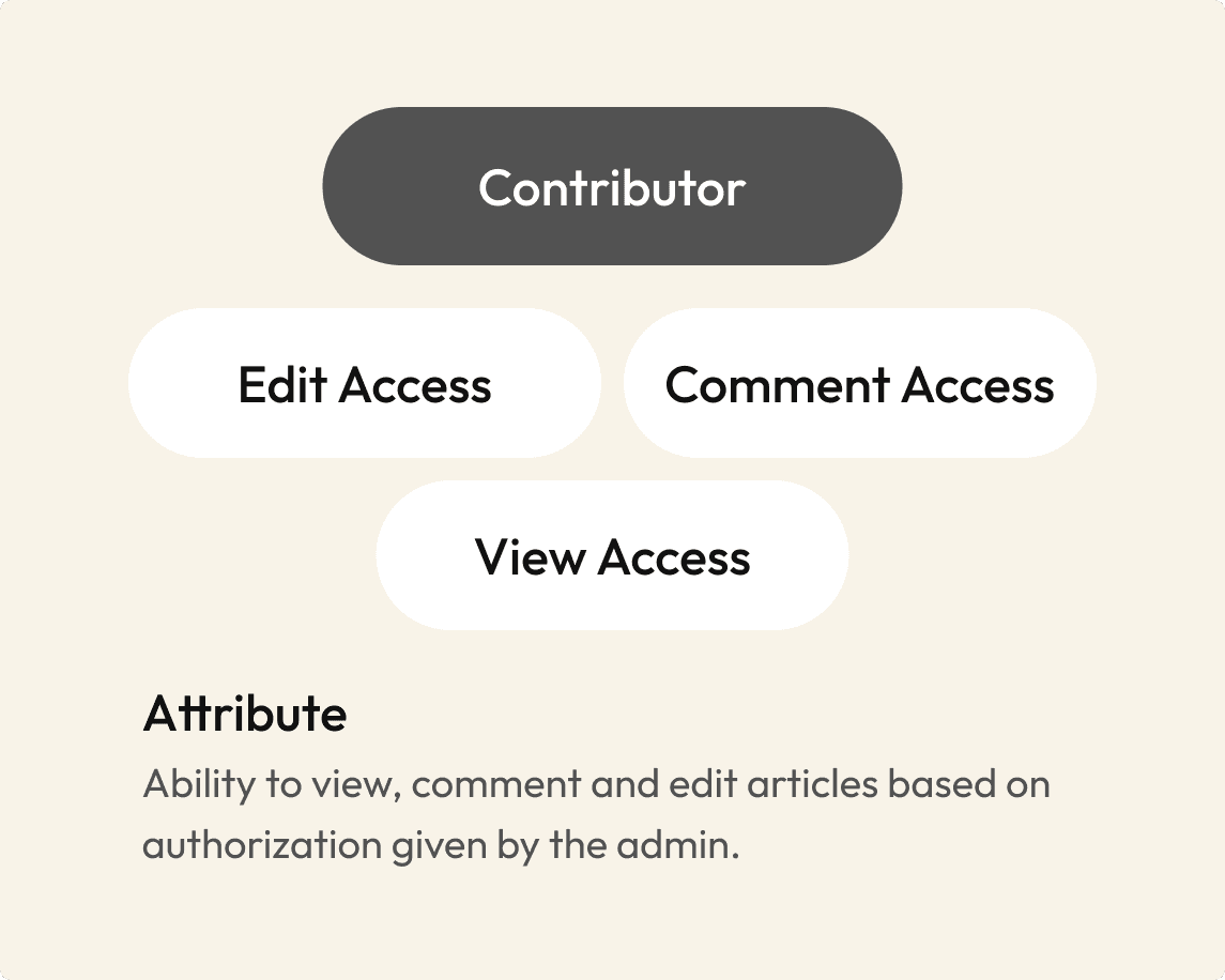
I also established the difference between admin and contributor access. Admin had all access while contributor had limited access to article and ownership in the platform, leading to different user flow.
User survey
I identified user pain points after conducting unmoderated user survey with two different end users. Some notable insights were:
7 out 10 admin users who used Github find it difficult to navigate comments that are live vs archived vs ambiguous.
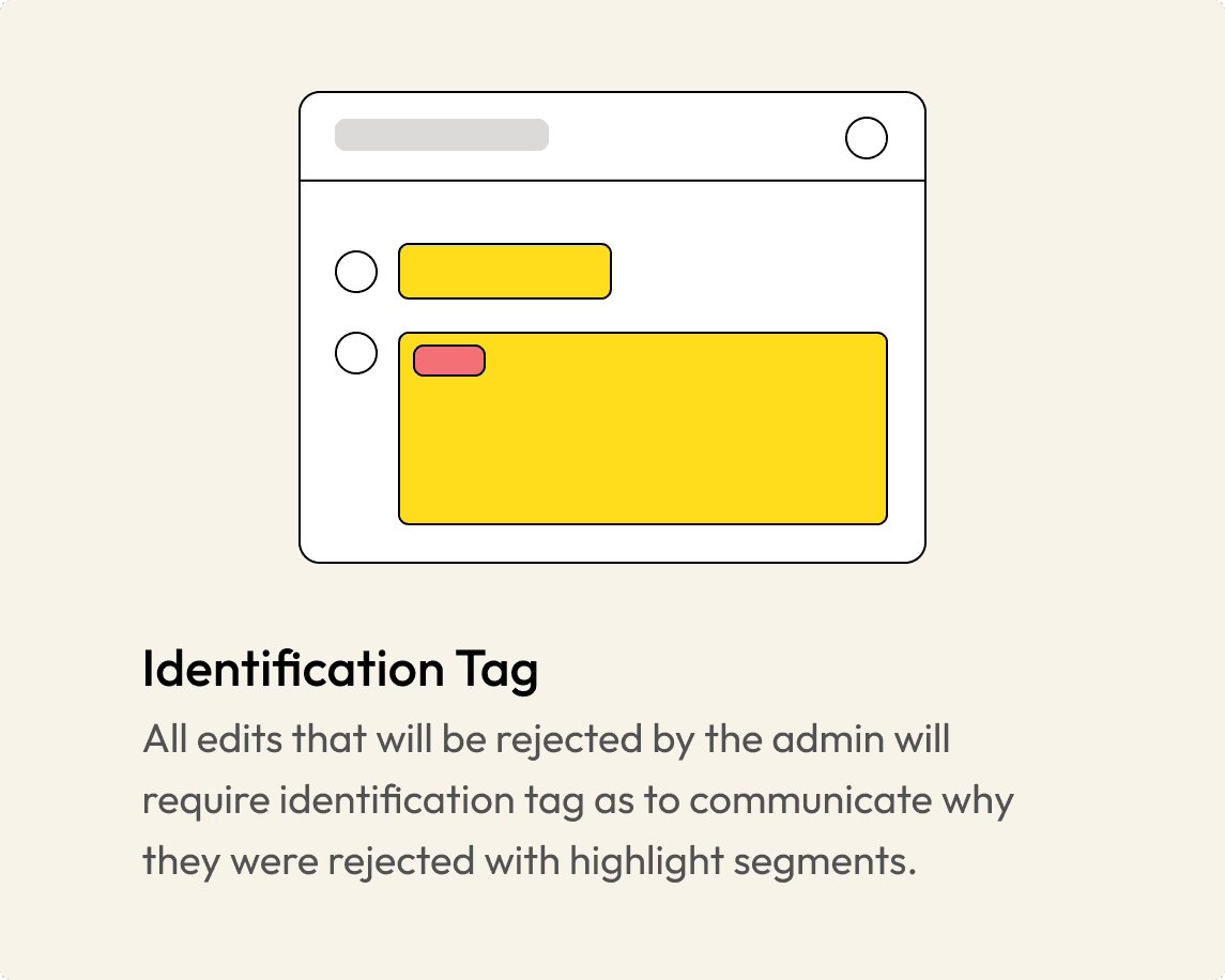
8 out 10 contributor users who used Github didn't know why their contribution was rejected by the admin, leading to frustration.
Develop - Ideation
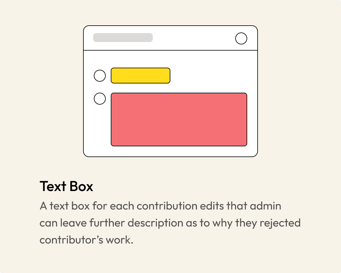
To address the problem, I explored different ideation for comment navigation and different ways admin can transparently show their decision to reject contributor's work.
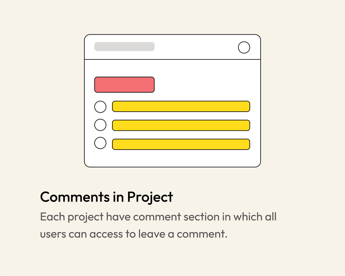
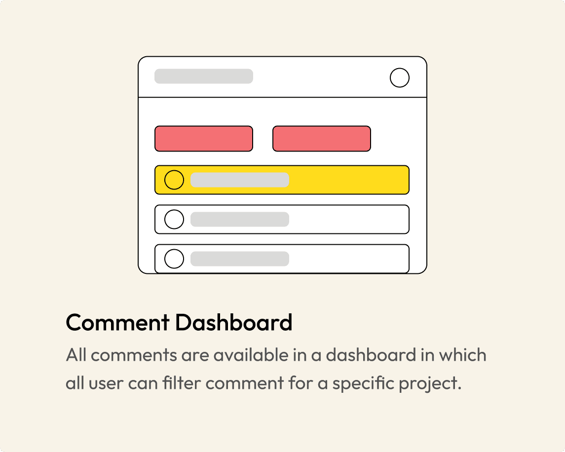
Comment in projects allows comments to function as a chat while comment dashboard is a forum thread.
Ideations for Contributor Pain Point
Low Fidelity
Dashboard
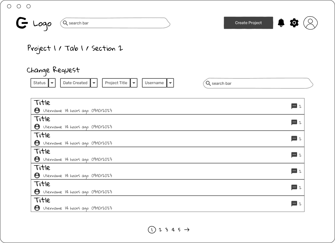
Change Request - 1
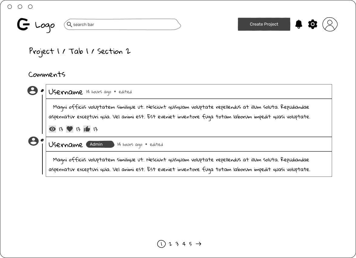
Change Request - 2
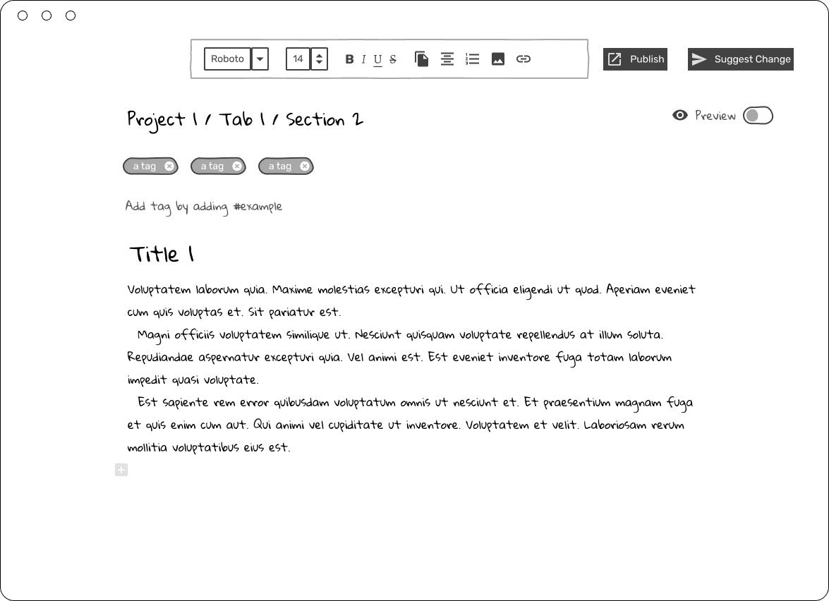
Edit Page - Admin
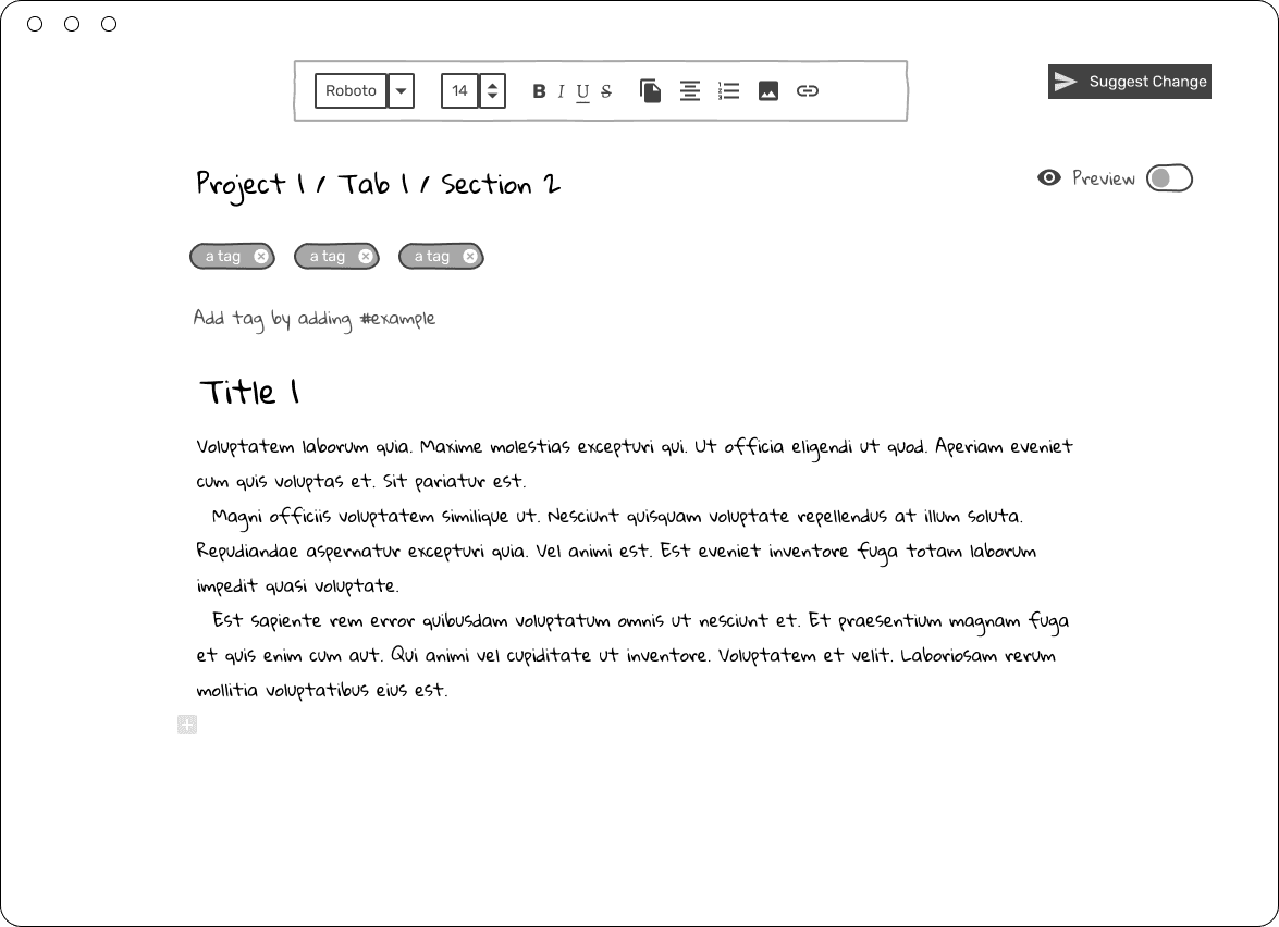
Edit Page User - 1
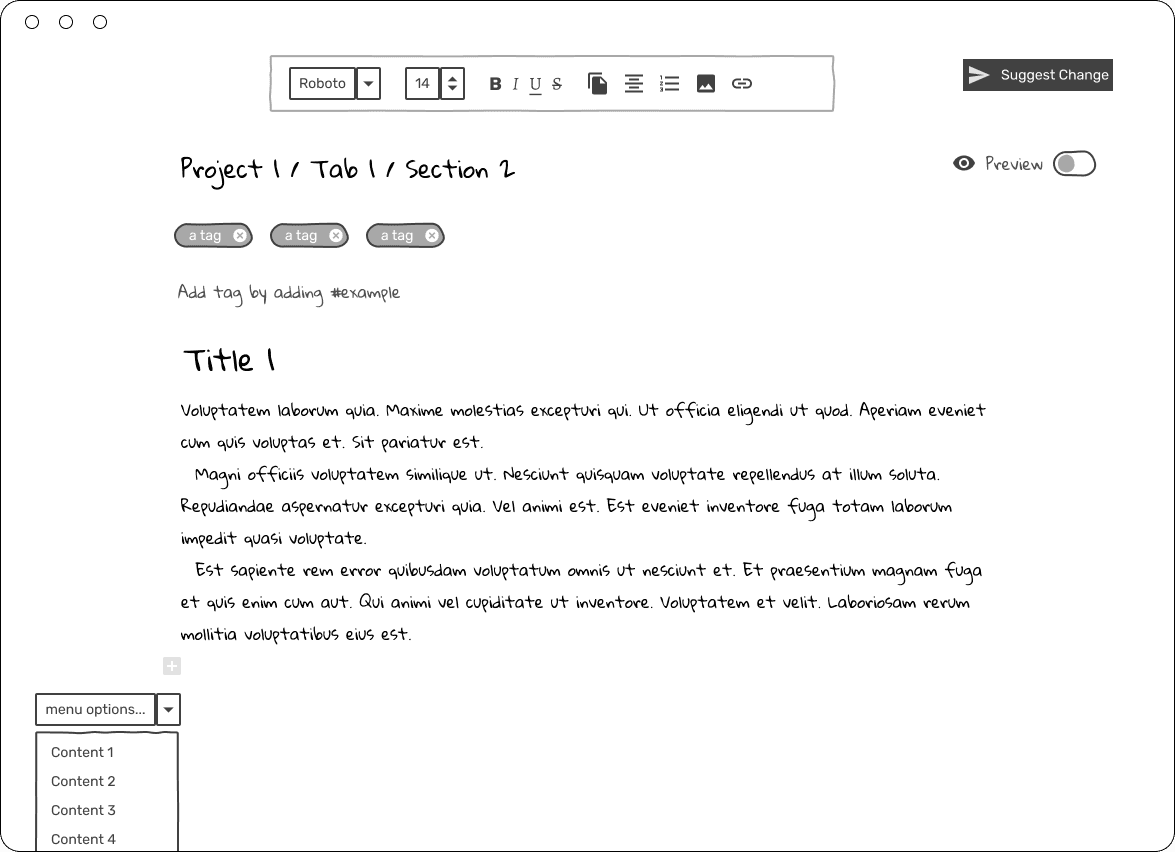
Edit Page User - 2
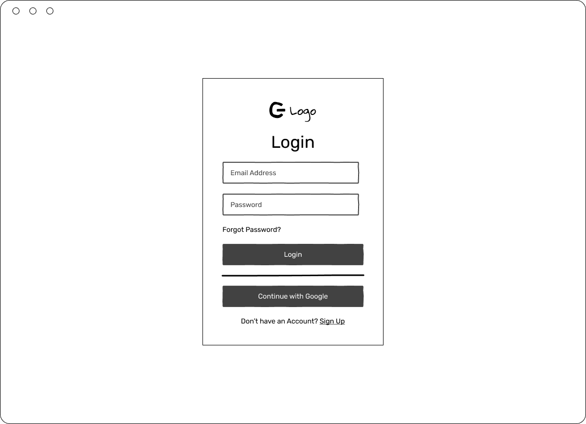
Login
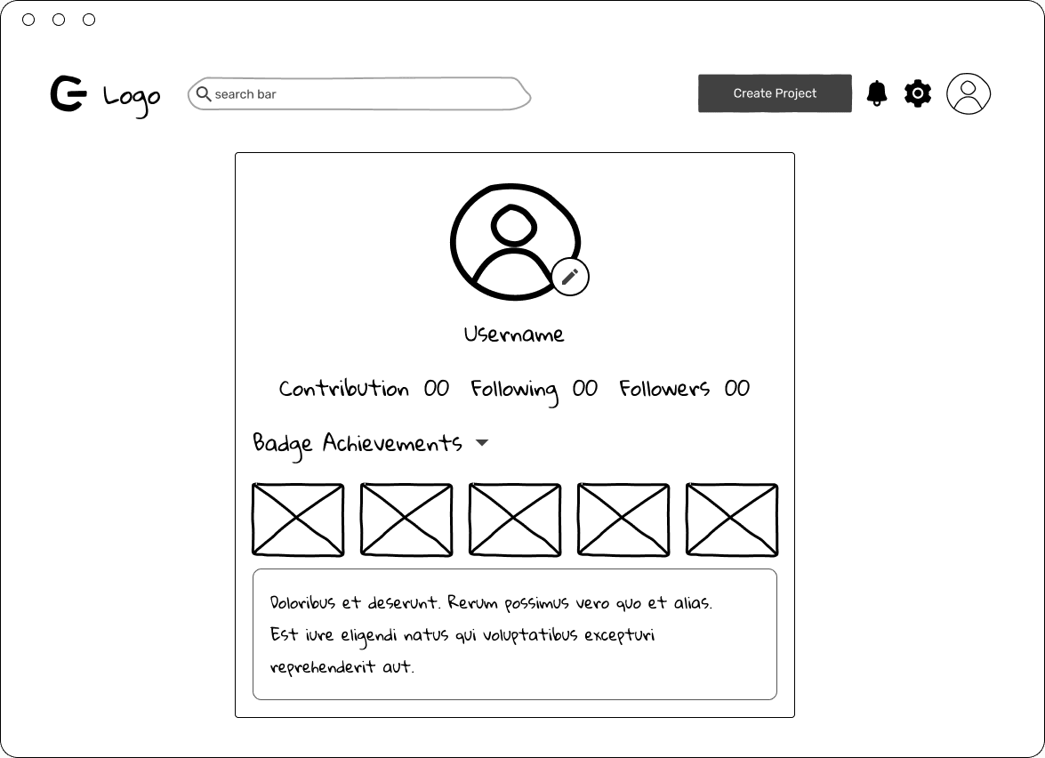
Profile Page
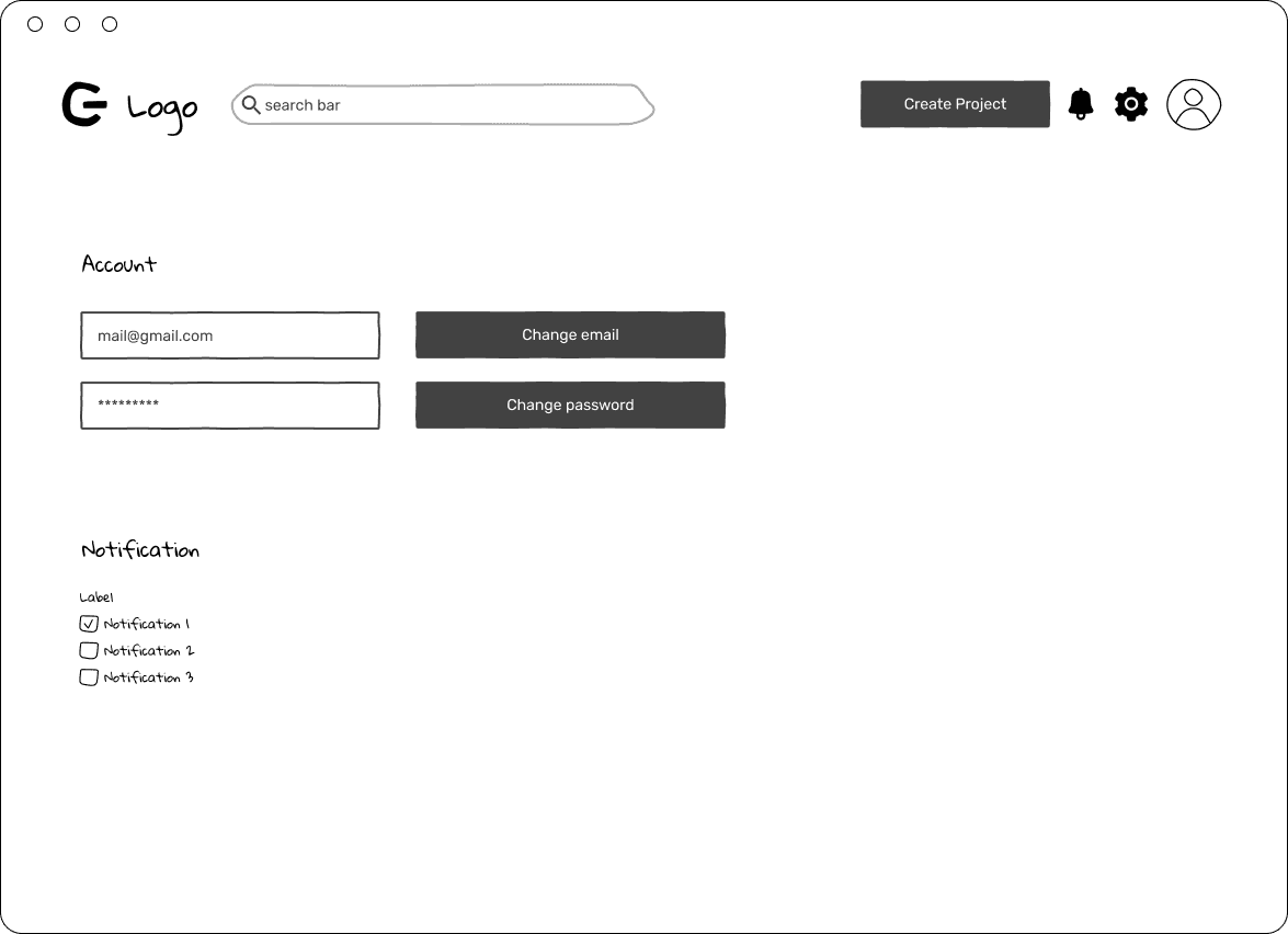
Settings
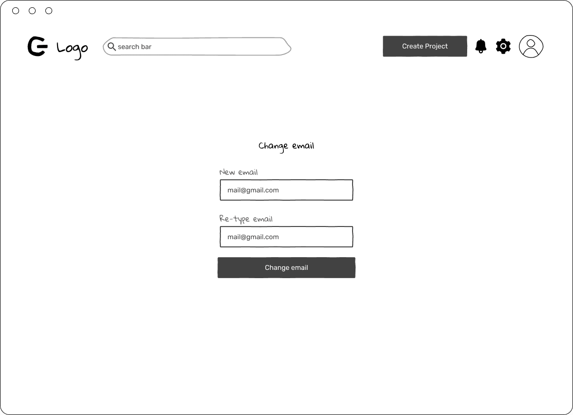
Change Email
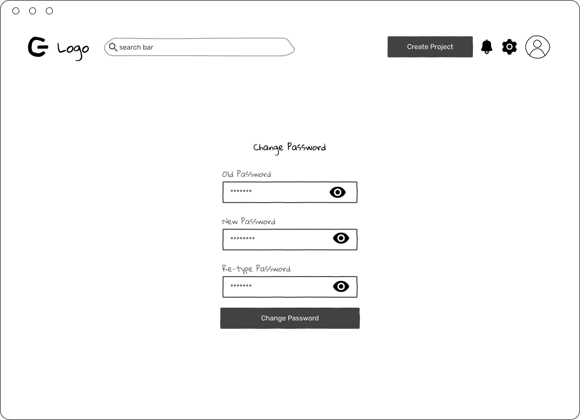
Change Password
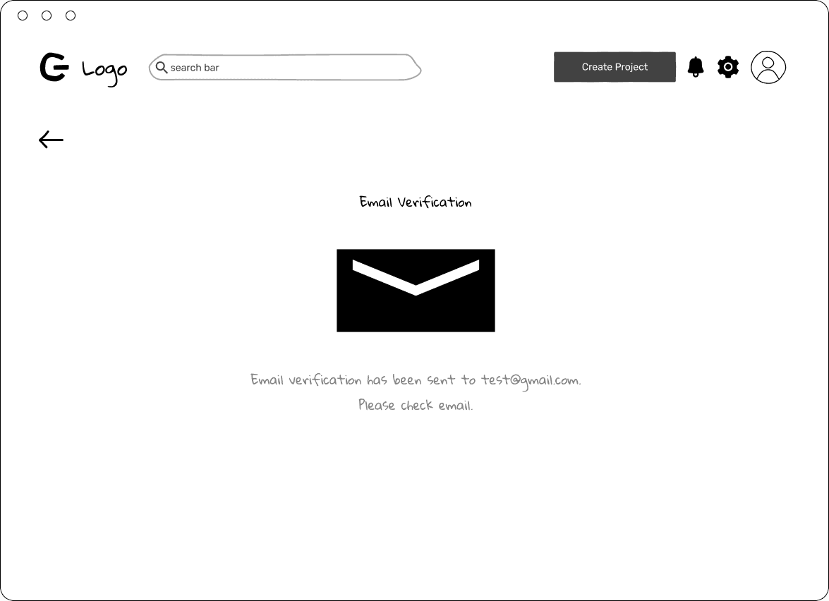
Confirmation Message
Email address
New password
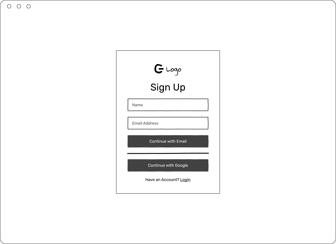
Sign Up
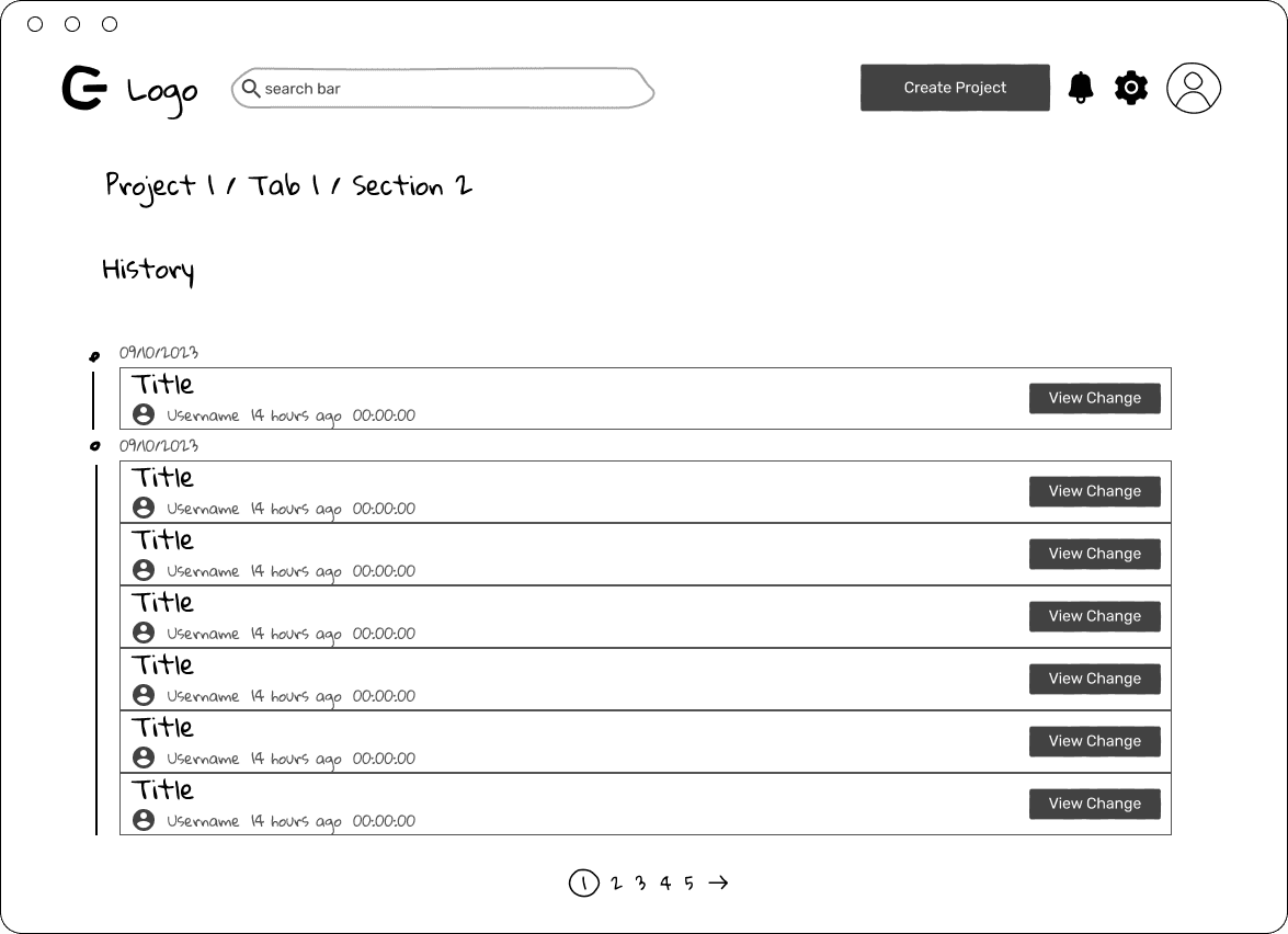
View History
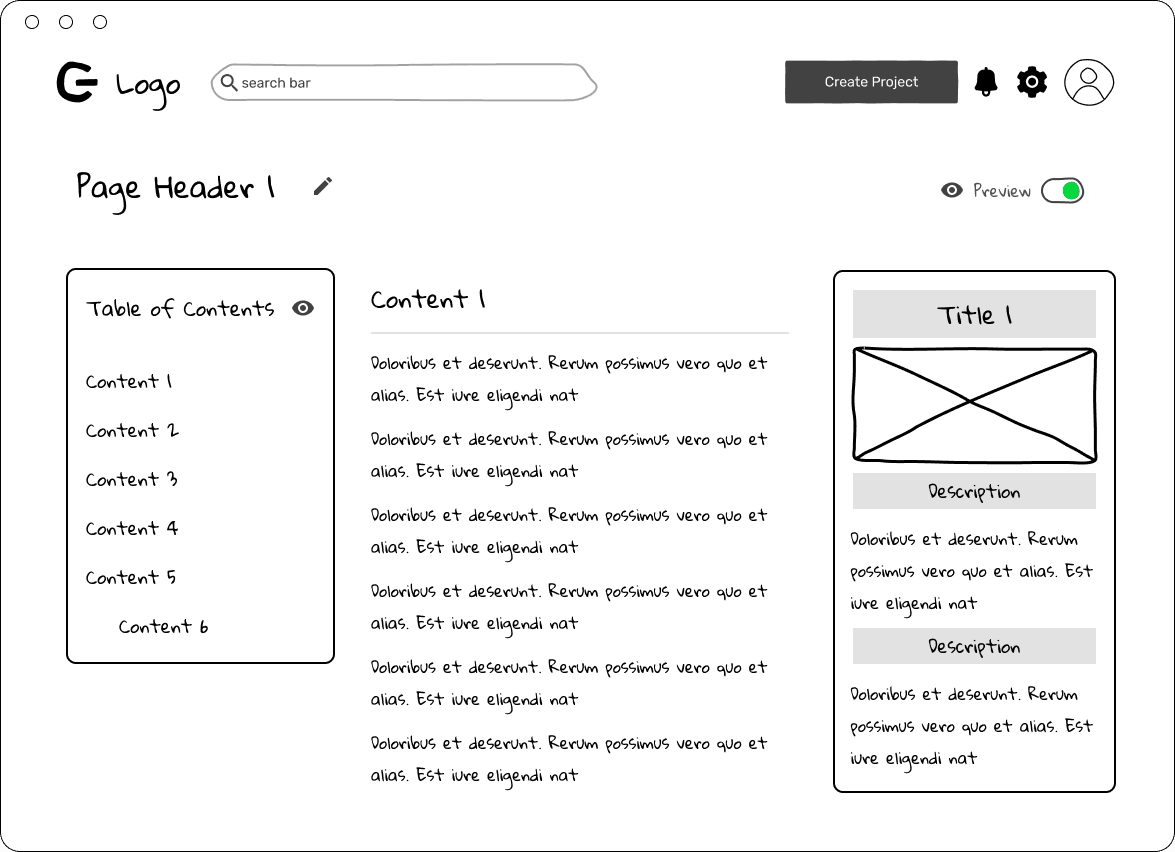
View Page - Preview
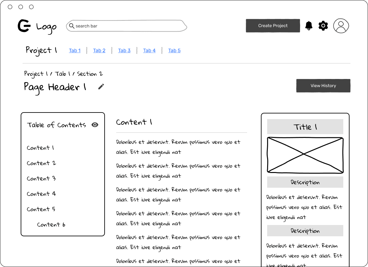
View Page Original
Final solution
After proposing the two different ideas, we decided to move forward with project based comment to better categorize comments.
For contribution being rejected by the admin, we decided on simpler identification tag for admin to categorize the comment and visually present why they were rejected.
Since I was working on this project as a solo designer, there was a higher risk of making design mistakes. I received help from a design community to validate the design and further improve the UX/UI.
Deliver: Final Design

Dashboard
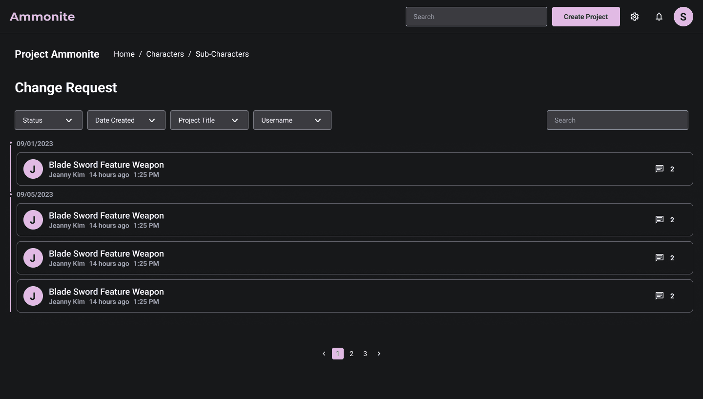
Change Request - 1
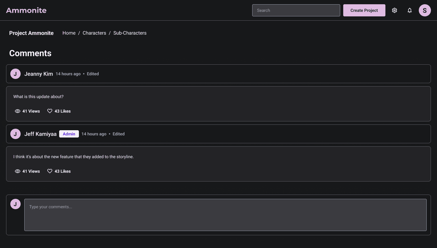
Change Request - 2
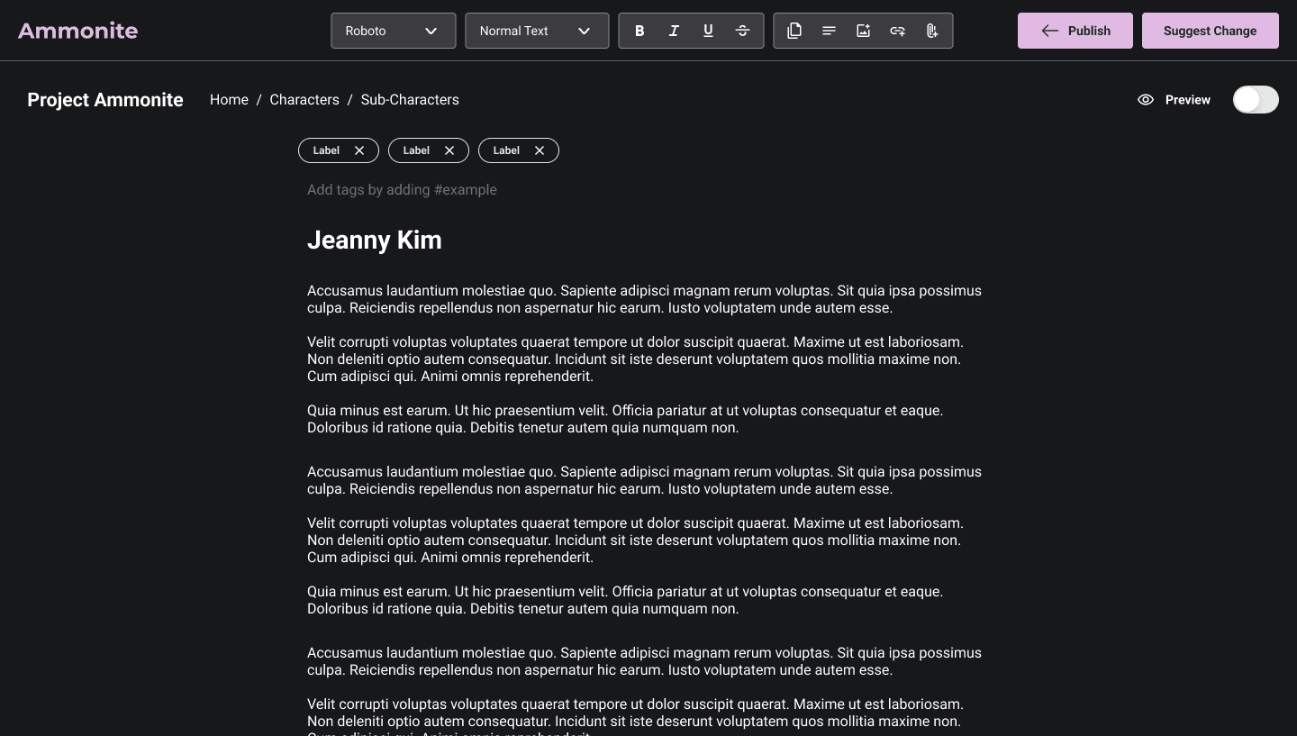
Edit Page - Admin

Edit Page User - 1
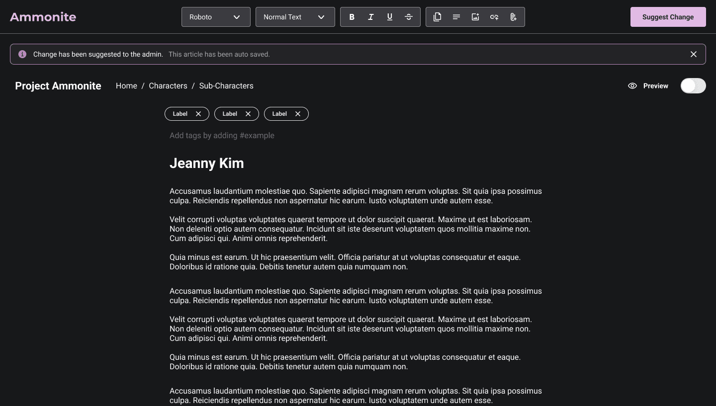
Edit Page User - 2

Login
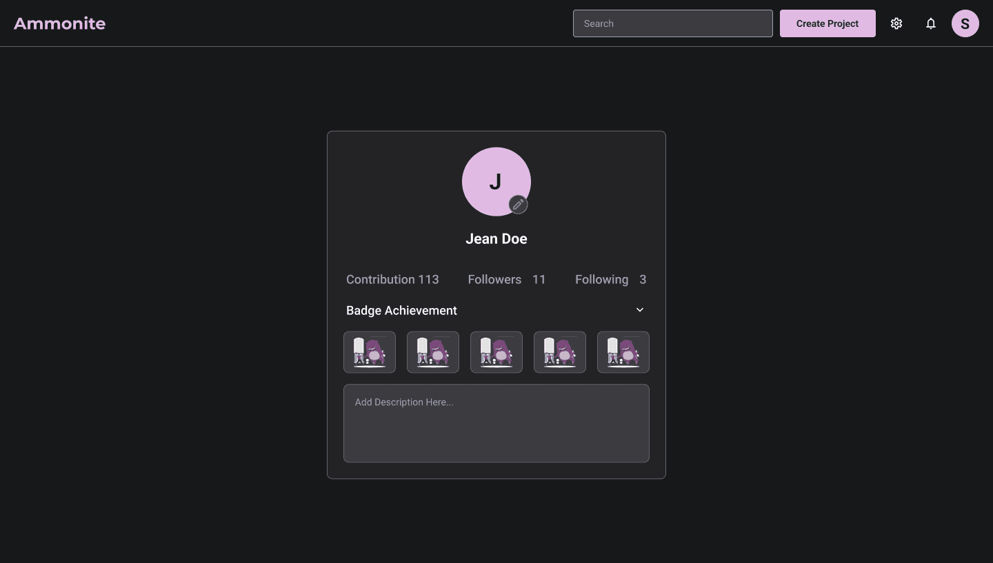
Profile Page
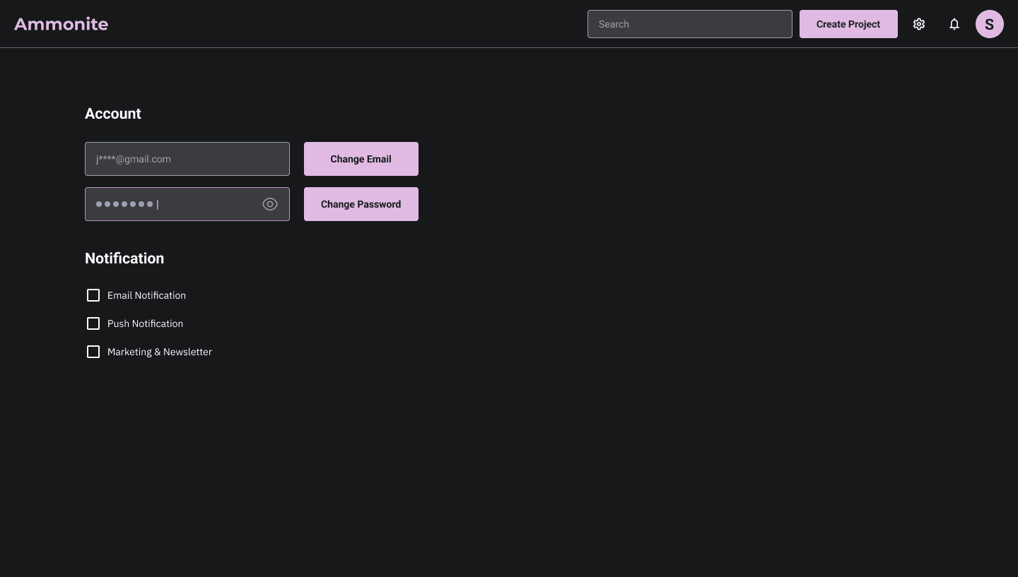
Settings

Change Email
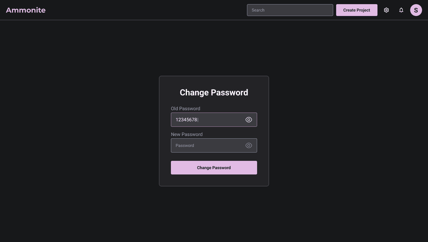
Change Password
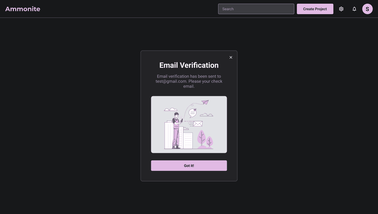
Confirmation Message
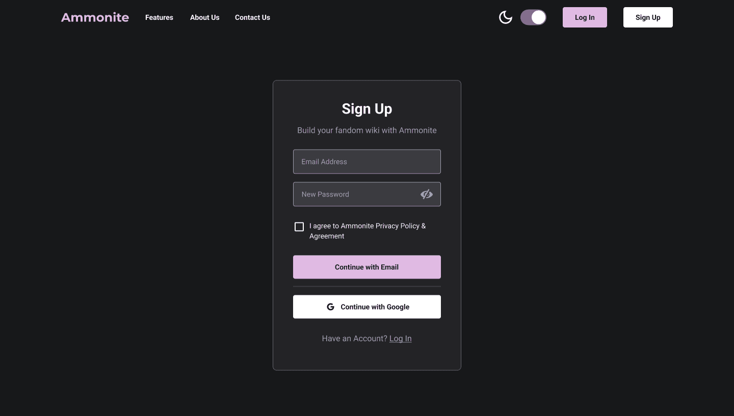
Sign Up
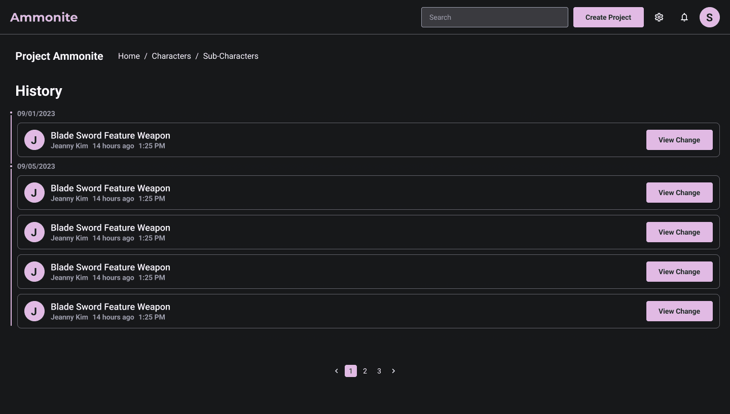
View History
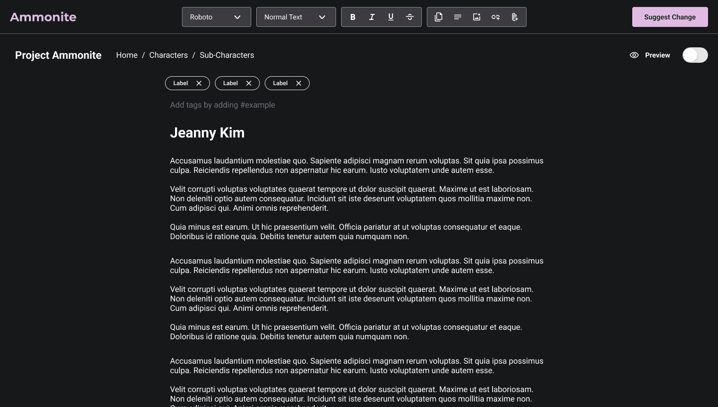
View Page - Preview
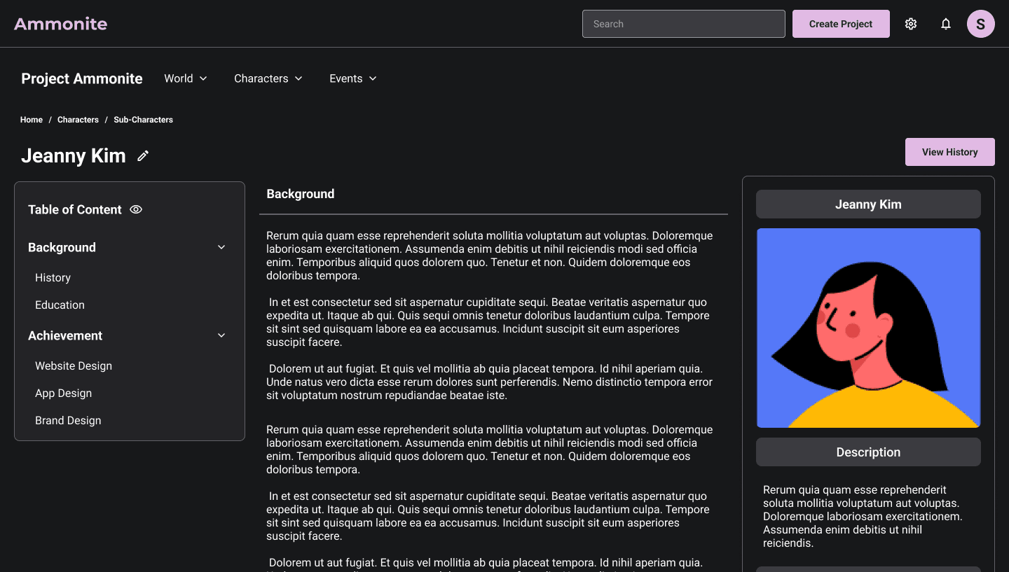
View Page Original
Reflection
Taking the time to explore different iterations helped deliver a higher level of UX design.
Receiving feedback from a design community significantly improved the UX/UI when delivering the final design.
Allowing more flexibility in design decisions fundamentally enables the project to progress faster and more efficiently.
This project is archived.
Please reach out if you'd like me to retrace my flight path.
