MTL ON MANGE
CAUS: October 2021 - March 2021
My role
UX/UI Designer - Logo Design, UX/UI Design, User Flow, Design Iteration, Prototype
Tools
Figma, Zeplin, Balsamiq
Timeline & Stutus
January-March 2021, Launched
Overview
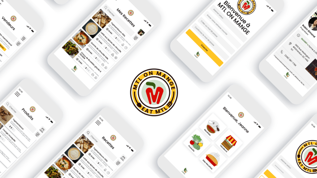
MTL on mange is a web mobile app that allows locals in Montreal to search for local vendors who sell local products. Using the local produces, they are able to create delicious seasonal recipes to their preferences. This app was supported by the community through crowdfunding platform called La Ruche and raised over 10,000$ to be brought to life.
Team
Tracy Arial: Product Owner/Supervisor
Arial G: User research
Carina K: Graphic Designer/Mentor
Balsamiq: UX Designer
Developers: Elintegro Inc
Highlights
Mobile app for finding local vendors, produce and recipe.
Team Work
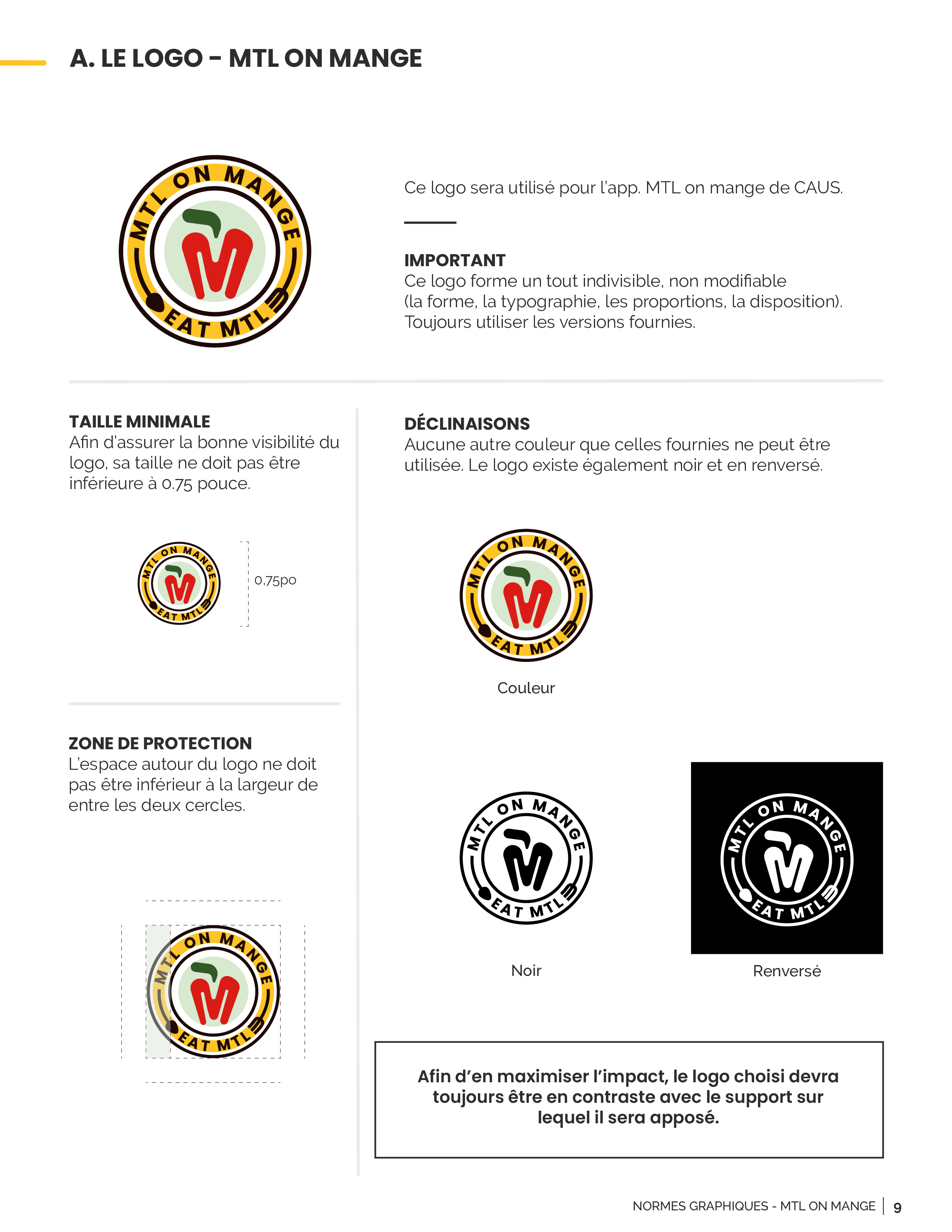
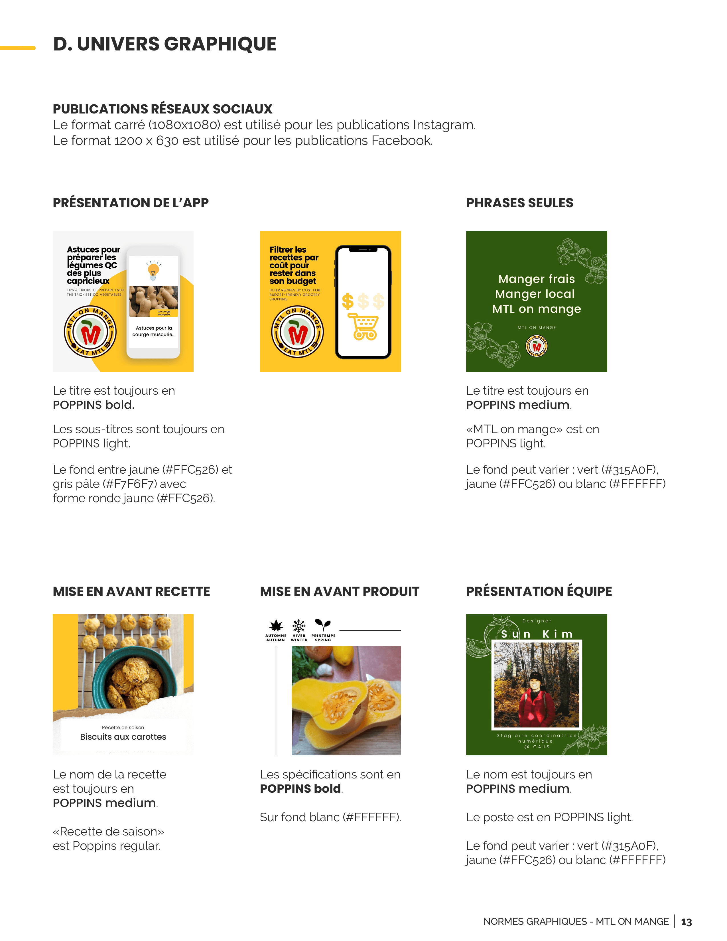
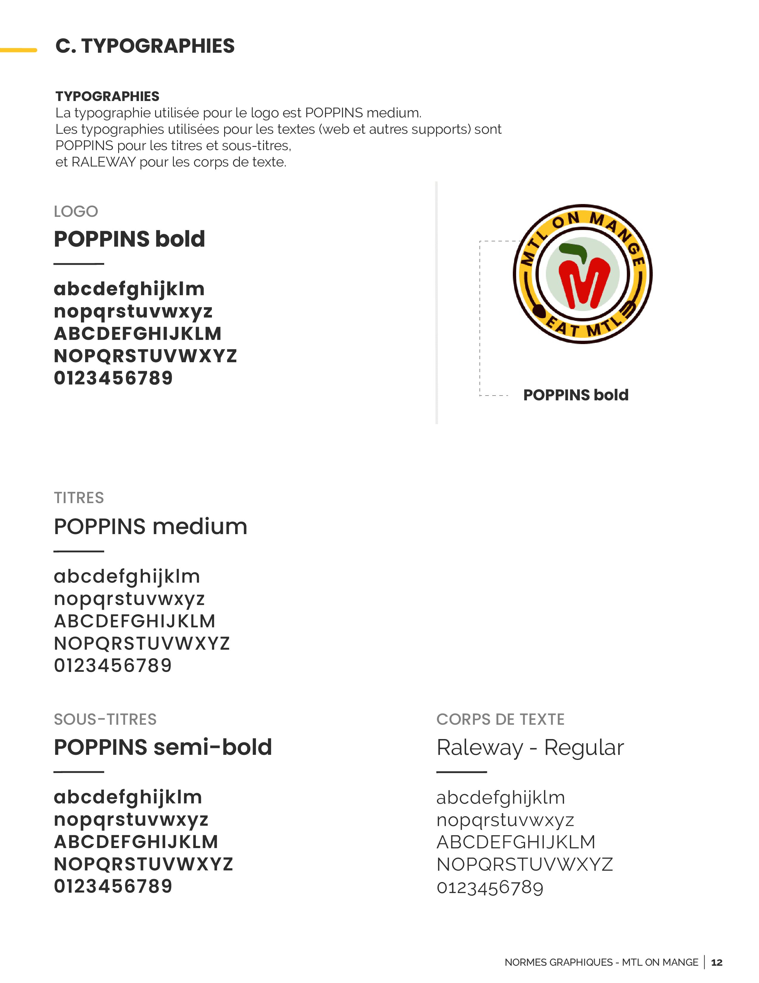
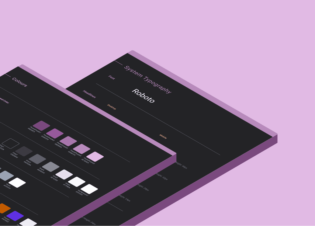
I worked with Carina who was hired as a graphic designer in creating the brand identity and guideline.
Impact
Some impacts that this design made.
Designing mobile application allowed the organization to increase user engagement by 38% and fulfilled all of its milestone from the crowdfunding.
Process
How I worked on progressive web application mobile design.
Emphasize & define
User research was done by Arial and Tracey who had in-depth knowledge of the community of local vendors and connections. They interviewed the consumers and vendors to confirm:
What features each group would want to have in the application
How they expect the application to work
Why each group would use the application vs why each group wouldn't
Received user feedback from sprint version 1
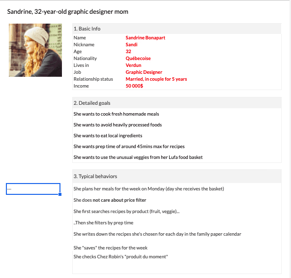
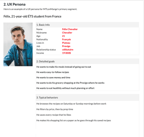
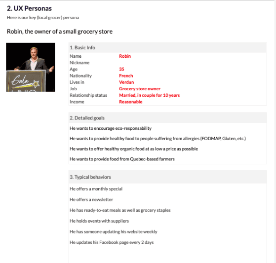
User personas
User personas were separated into two groups: consumers and vendors. This separation allows:
Vendors to edit and update their own information
Easy access to information that consumers are looking for
Connect two groups in a single community
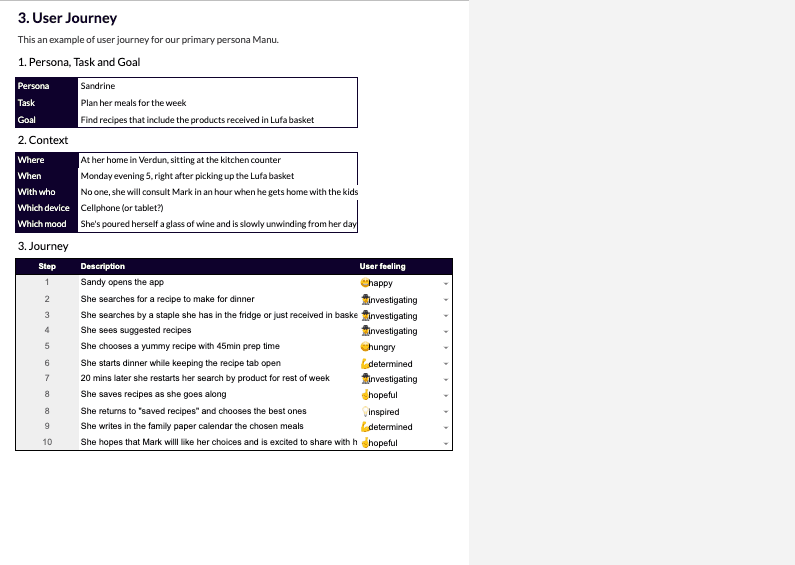
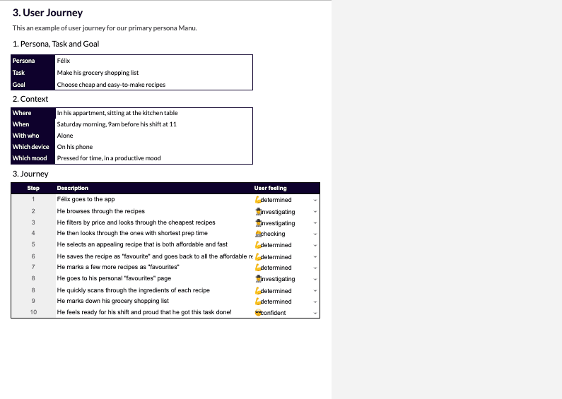
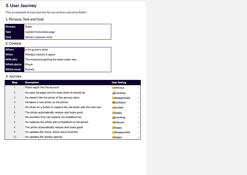
User journey
User journeys showed:
Task and goals of consumers and vendors
Step-by-step on how they would interact with interfaces
Emotions of consumers and vendors when interacting with the application
Sitemap
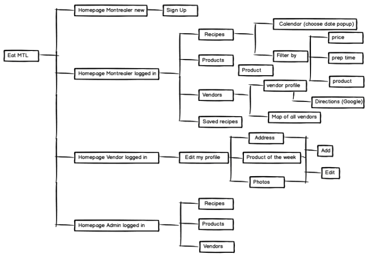
Balsamiq created the sitemap and I was given approved sitemap by product owner to work on high-fidelity wireframe.
Balsamiq site map
First Wireframe iteration
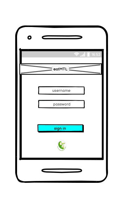
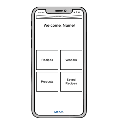
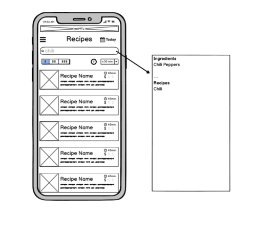
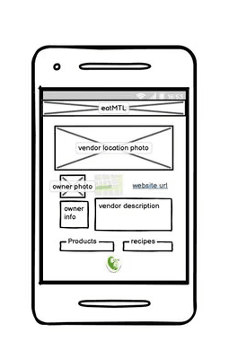
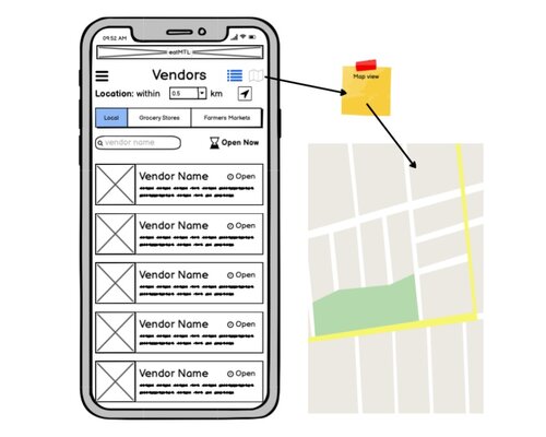
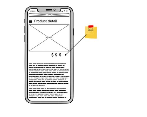
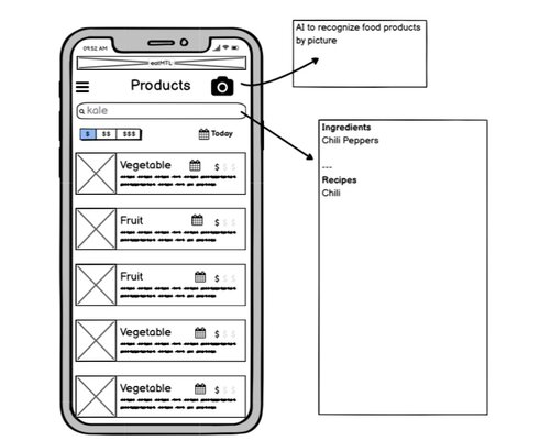
Low-fidelity wireframe created by Balsamiq.


Problem 1
Balsamiq original contribution of low-fidelity wireframe and site map were not reflective of user personas, user journey and other constraint involving time and budget issue.This resulted in lack of heuristic categorization for consumer versus vendor user need.
Solution 1
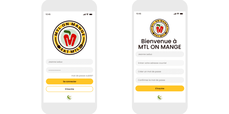
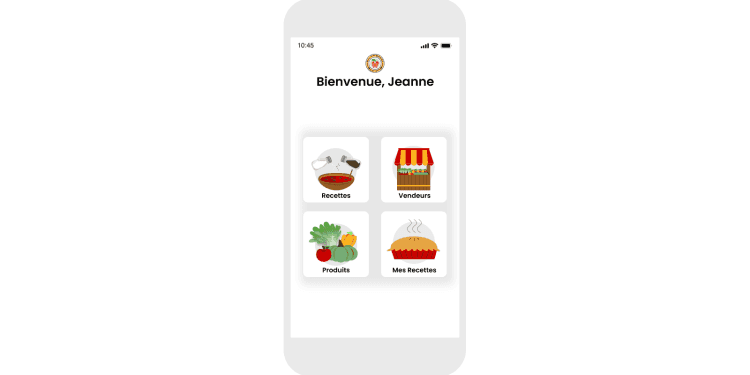
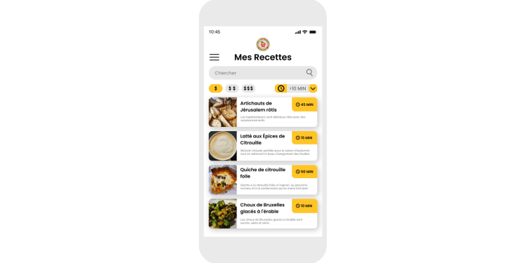
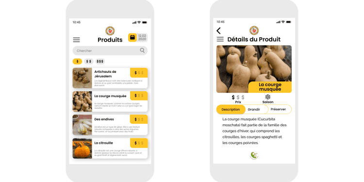
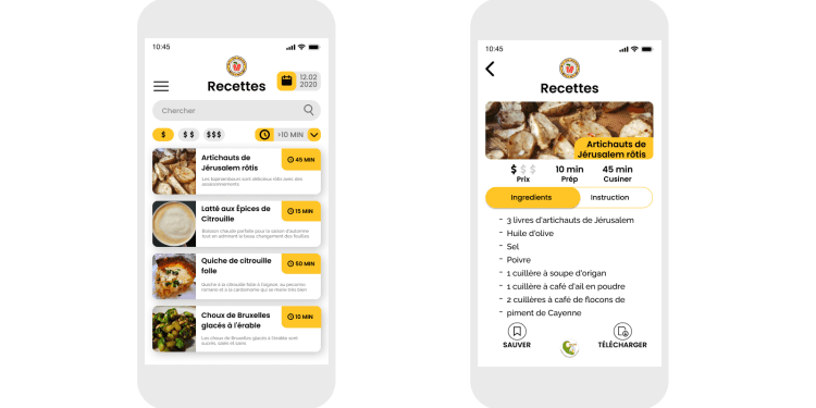
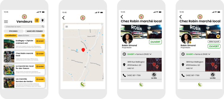
Prototyping was done with initial plan of creating one sprint, but as the development progressed, changes had to be made. These are changes that I made to reflect the developing project:
Product identifying camera function was omitted
Identifying as Montrealer was omitted
Placement of information and buttons were altered
Vendor profile was altered based on best practice
Addition of “consumer profile”
Addition of “our partners”
Usability testing
3 random vendors were selected to use and test the prototype. These were requested feedback:
Filter the recipe by meals and restrictions
filter the product by grocery and farmers market
filter the vendor by organic, zero waste and regular
Problem 2
Adding more search filters were requested after usability test. This was a problem because it would change the overall initial design, and we weren’t expecting to make a second sprint with the budget especially when the development was well underway.
Solution 2
This meant I had to present the information of the filter for recipe, product and vendor the best way possible. Here is what I did:
Reduce the search filters plug-ins to one menu interaction to allow users to add filter(s) once
Inform the user of icons with text associations in the filter menu through colour association
Present the information in card component
Final Design
This project is archived.
Please reach out if you'd like me to retrace my flight path.

